Managing Dynamic Layout at Design Time
06 March 2018—11 min read / Dynamic layout is a necessity for modern UIs. How might we balance the familiar, direct-manipulation experience of drawing tools with the reality of production constraints? This article demos some of the concepts built for Subform, a UI design tool.
“Design depends largely on constraints.” —Charles Eames
“Constraints are not limitations; they are insight.” —Steve Sanderson
In digital product design, a common constraint is that interfaces need to function across a diverse set of devices. Print designers know the physical size of their output, be it an A4 page or a 48-foot billboard. UI designers aren’t so lucky—a single software product might need to support smart phones, tablets, laptops, desktops, and TVs, and so on.1
Exploring and designing to this constraint can be difficult with static visual tools. Drawing a picture of every possible layout is a ton of effort (though perhaps easier than trying to simulate all of the complexity in your head). Often times, designs just go to production with the dynamic layout aspects completely or partially unresolved: the design decisions get kicked over to engineering.
To be sure, tooling on the production side is a bit more powerful: dynamic layout engines like CSS’s flexbox, iOS’s AutoLayout, and Android’s ConstraintLayout allow the front-end engineer to create rules and relationships between elements—and then let the computer handle the pixel pushing. Exchanging a visual design tool for code has its own tradeoffs, though. If you’ve ever done layout with CSS, you’re probably familiar with this dance:
- Juggling confusing syntax (“what’s the difference between align-items and justify-content again?”)
- Debugging unexpected outcomes or errors (”wait, where’d my button go?”)
- Reloading, checking results, tweaking values, reloading… ad nauseam
The tension here is that while dynamic layout is functionally complex, creating it is more of a visual process. And visual design tasks really benefit from direct-manipulation and a tight feedback loop:
“Huh, this layout really doesn’t work when the viewport is narrow. What if I moved this over here? No, that’s not right. Maybe these icons should stack vertically? Yeah, that’s better. Let’s add more space between them. Whoops, too much space. Let’s try cutting that in half. Perfect.”
This raises some interesting questions. If creating dynamic layouts for production UIs is a visual process, why aren’t there visual tools for it? And shouldn’t designers be exploring and defining layout behavior—clearly within their domain expertise—rather than relying on engineers to do it?
Production-focused design tools haven’t found wide acceptance.
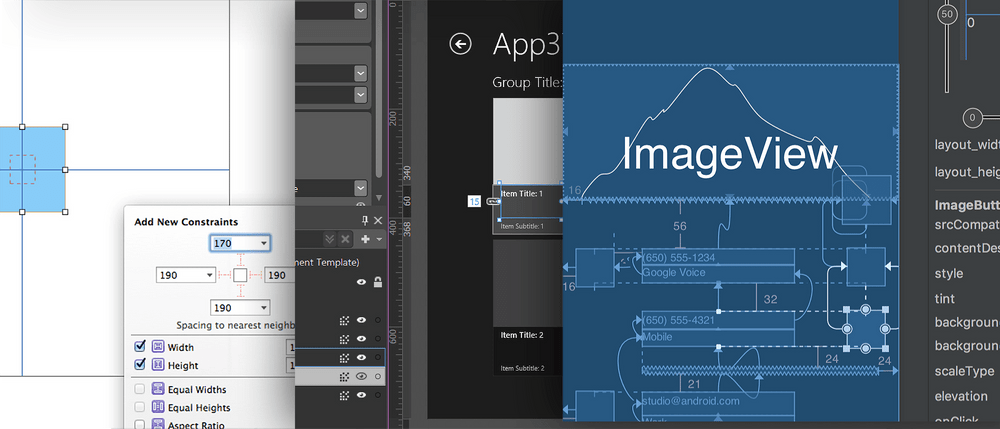
To be completely fair, building dynamic layouts programmatically isn’t the only option: IDEs like Apple’s Interface Builder, Android Studio, and Microsoft Blend for Visual Studio all have visual layout editors2. But while these tools are sometimes used by front-end engineers, they haven’t really caught on with product designers.

It’s likely that there are multiple reasons for this, but my primary theory is a simple one: tools that surface production constraints often feel too restrictive to designers. This is particularly true during the divergent phases of design, where you need to quickly conceptualize and explore a variety of possibilities. Constraint-based tools can force you to formalize design decisions and wrestle with details before you’re ready. It often feels like the tool is fighting you, rather than being a medium for thought.3
On the other hand, completely freeform drawing tools make it a bit too easy for designers to overlook the real-world production constraints. Recognizing and responding to constraints is perhaps the crux of the design process. It’s what separates a design decision from a random act. Operating inside of constraints often yields more focused, insightful, and useful solutions.
Can we balance layout constraints and direct-manipulation?
This particular problem domain—balancing the familiar, direct-manipulation experience of drawing tools with the realities of production constraints—is something Kevin Lynagh and I explored while building Subform.
Since dynamic layout seems to be a particularly acute pain for both designers and engineers, we decided to focus our deep-dive there: could we surface layout constraints at design-time in a useful and usable way, while still being true to the production medium?
Here are a few of the principles we came up with, along with some real-world examples recorded out of Subform.
Principle 1: Where possible, layout constraints should make design changes easier, not harder.
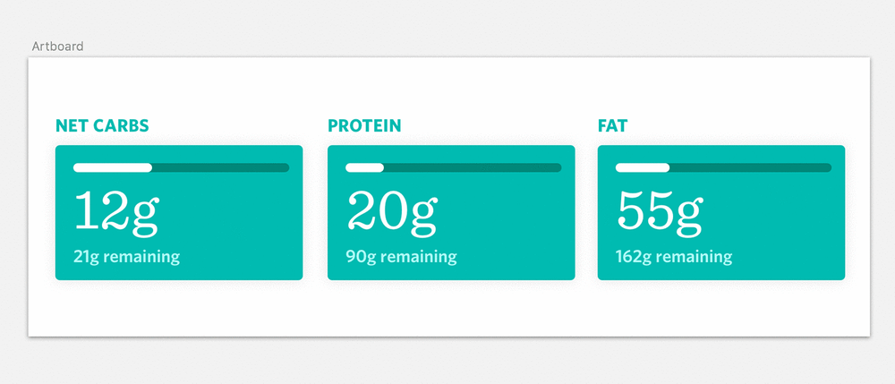
Say you’re designing a macronutrient breakdown screen for a nutrition app. The initial concept is to arrange protein, fat, and carbohydrate counts as a horizontal stack that spans the width of the viewport.

After a review, the team suggests that maybe dietary fiber should be shown on this screen as well. With just freeform drawing4, mocking up the change looks something like this: duplicate one of the boxes, do some calculations to figure out the new sizes for everything while preserving consistent spacing, resize and align all the boxes, then change the text.
It’s straightforward to make this change in an unconstrained tool, but it’s not easy. It’s time consuming and increases the chances you’ll accidentally screw up the existing design.
In Subform, working within the constraints of the layout engine can actually make this change easier. The layout engine is smart enough to automatically divide up the available space between the micronutrient counts. To add a box for fiber, you can just duplicate one of the existing boxes and change the text:
That’s great, but making a design change like this often just raises additional questions. Where should fiber sit in the order—first, last? Should the fiber box be wider than the others for emphasis?
This is another case where using constraints allows the designer to offload this busywork to the computer. In Subform, you can simply drag-and-drop the fiber box to reorder it to any position in the stack:
While you drag, an overlay of the stack’s spacing appears, along with an indicator for where the element will be placed. On drop, you’ll see that the other elements in the stack rearrange automatically, with all the spacing preserved.
Rearranging and resizing the elements inside of a grid works much the same way. If the macronutrient UI is configured as a grid, when you drag or resize the individual elements, they’ll snap to the grid lines shown in the overlay:
Principle 2: Easy direct manipulation of hierarchy is a necessity.
Just being able to move things around inside of a single stack or grid is still pretty limiting. Visual exploration needs to be more flexible than that.
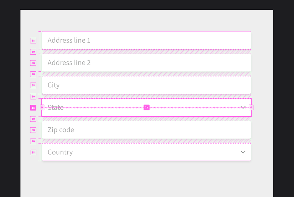
Imagine that you’re designing a form. After laying out all the required inputs, you’d like to see if it could be more compact, maybe by doubling up some of the inputs into single rows.
In Subform, elements can be drag-and-dropped between different stacks. Starting out, you designed the form to be one main vertical stack of elements:

To put two inputs on a single row, you’ll need to nest a child horizontal stack inside of that main stack, then drag the inputs inside of it:
In production, interfaces are usually built out of this sort of hierarchy (like iOS’s view hierarchy or the web’s DOM). The hierarchy formalizes relationships between elements. Those relationships are then used to control things like size and position.
Hierarchies can quickly get deep, so navigating them with only a tree or layer menu can be unwieldy. (Perhaps you’ve experienced this pain when working with a lot of nested groups in Photoshop or Sketch.)
To improve this, we introduced a contextual helper for navigating the hierarchy right in the canvas. While dragging an element, you can simply press the tab key to cycle through all the elements underneath the mouse cursor:
This makes moving elements between different parts of the layout much easier. Elements can not only be moved between different stacks, but also between stacks and grids. Maybe you want to start exploring the form as a grid layout, instead of a stack. By holding down the alt key, you can copy the input element between a stack and a grid (rather than just moving it)—and even place it in a specific grid location:
Principle 3: It should be possible to move between constrained layout and freeform manipulation.
Sometimes you just want to get ideas down quickly. It’s hard to beat freeform sketching for that, so Subform still allows you to draw and direct manipulate text and boxes in a traditional manner…
...when you’re ready, the elements can be formalized into a layout, where they benefit from the power of constraints: consistent spacing, quick re-ordering, adapting to the size of the parent, and so on.
You can also always pop any element out of its stack or grid layout. In this “self-directed” mode, an element ignores its parent’s layout rules and can be more freely transformed:
Conclusion
A lot of designers feel frustrated that current visual design tools don’t really represent the realities and requirements of the production medium. Software is conditional, stateful, data-driven. Drawing pictures of interfaces (even animated ones) just doesn’t simulate that.
It’s a hard thing to balance. The easy-to-learn and freeform nature of traditional drawing tools is well-suited to quickly exploring ideas. Introducing production constraints can often just turn the tool into a lousy simulacrum of the real thing, leading to a lot of extra work creating artifacts which aren’t really any more useful when building the product. Both sides end up worse for the effort: “those who chase two rabbits catch none.”
On the other hand, the promise of surfacing constraints during the design process is that it can lead to new insight, a faster feedback loop, and more easily implemented solutions.
Despite our best efforts, it's a tension that we weren't quite able to resolve successfully in Subform. It'll be interesting to see how other tools approach this challenge going forward. (Editor's note: Since this article was originally published, some of these ideas have indeed surfaced in other tools, such as Framer X's stack features, Webflow's visual CSS grid builder, and Figma's smart selection.)
-
The physical display size of the device isn’t the only variable. Apple recommends, for example, that apps for iPhone and iPad actually support over 60 different viewport resolutions. Reading distance and input type (e.g., touch vs. mouse vs. TV remote) can also influence the designer’s layout decisions.
↩ -
This list isn’t exhaustive, of course (and there are also non-IDE examples). Of note: many drawing-based tools like Sketch have added basic “pinning” or “resizing” constraints (what Apple called “springs & struts”). I’m not including them here because, while easy to use and understand, they don’t really simulate most production layout systems—and tend to break with any sort of real-world layout complexity. (For this latter reason, Apple later added the AutoLayout constraint solver.)
↩ -
There’s quite a bit of interesting literature on things like divergent vs. convergent phases of design and how sketching and drawing serves as a medium of thought for designers. This subject is better suited to a separate article, but if you’re interested, Donald Schön’s The Reflective Practioner is a good place to start.
↩ -
This example is from Sketch and does use that app’s resizing features (e.g. the bar charts resize automatically with their group). As mentioned in footnote #3, these are a type of constraint, so this isn’t a true example of a completely freeform tool. But it’s a more accurate representation of how you’d probably do this process in today’s commonly used visual tools.
↩