
Are Grid Systems Still Relevant in Digital Product Design?
13 March 2017—8 min read / Design systems are more useful than ever, but formal grids don’t always translate well to UI/UX work. This article takes a look at the history of grid systems and their practical advantages. While grids are still useful for interface design, the screen is much more complex than the printed page, as both the output media and content are highly variable.
In 1928, German typographer Jan Tschichold published the modernist graphic design manifesto Die Neue Typographie. Initially inspired by a Bauhaus exhibit on Russian constructivism, Tschichold believed that effective communication design could be codified into formal, standardized rules for typography and page layout:
“The function of printed text is communication, emphasis (word value), and the logical sequence of the contents. Every part of a text relates to every other part by a definite, logical relationship of emphasis and value, predetermined by content.”
This concept was enormously influential on the post-war generation of Swiss designers, including heavyweights like Max Bill, Emil Ruder, Armin Hofmann, Karl Gerstner, and Josef Müller-Brockmann. In what eventually became known as the International Typographic Style, these designers built on Tschichold’s work with page layouts based on strict, mathematical principles of uniformity and proportion.
But it was Müller-Brockmann who was first to formalize and document a grid system as a controlling principle for page layout. His work in the Neue Grafik design journal (1958–1965), The Graphic Artist and His Design Problems (1961), and the seminal Grid Systems in Graphic Design (1981) introduced practices for grid-based layout that became the modern standard.


Müller-Brockmann’s grids are modular. The designer first segments the page into 2, 3, or more columns, then further divides the page horizontally into 2, 3 or more rows. The heights of the rows should be determined by the type size and leading, so that the baselines of the text always align evenly with the horizontal divisions.

Each of the rectangles inside of this grid are known as modules. Content can then be aligned and sized to these modules in any configuration.
Design systems for new modes of production
For modernists like Tschichold and Müller-Brockmann, the industrial age demanded a dramatic shift in the role of the designer. To produce effective work in the age of mass-production, they felt that designer must understand and embrace the systematic, functional language of engineering:
“Distinguishing marks of [the engineer’s] work: economy, precision, use of pure constructional forms that correspond to the functions of the object.”
—Jan Tschichold, Die Neue Typographie, 1928
“This is the expression of a professional ethos: the designer’s work should have the clearly intelligible, objective, functional, and aesthetic quality of mathematical thinking.”
—Josef Müller-Brockmann, Grid Systems in Graphic Design, 1981
This was the zeitgeist that gave birth to the grid—and it’s easy to hear echoes of it today. Designers are wrestling with their roles in the digital product development process. Designing with programmatic and systematic approaches is becoming essential to manage the inherent complexity in creating software interfaces.
While the sociopolitical and aesthetic motivations of the modernists may be outdated, the practical advantages of grid systems are more relevant than ever:
- Clarity and consistency. Proportion, rhythm, whitespace, and hierarchy improve speed of cognition. Grids help create and enforce these elements consistently throughout an interface. This is especially important in digital products, because they’re functional. The user has a job-to-be-done: sending a message, booking a hotel room, or consulting a technical schematic. A wind turbine technician entering repair data into a tablet needs familiarity and clarity, not a spread from Raygun magazine.
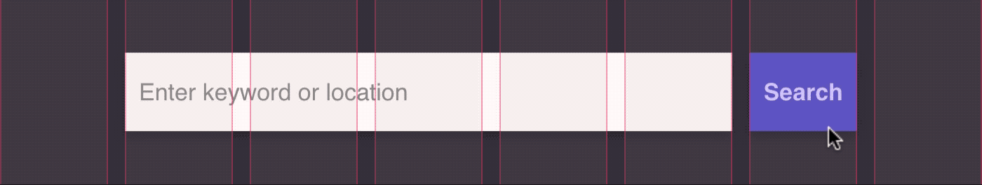
- Ease of description. To create things, you have to be able to describe them. Grids help the designer specify complex and responsive layouts with relative units, not absolute values. An element spanning the full width of a smartphone might be
320px,375px, or750px, depending on the device and screen density. In a 6 column grid, however, a full width element can always be described asspan-6. - Collaboration. Grid systems help to decouple work on an interface design. Multiple designers can work on different components and design details separately, while still knowing that the layouts will fit together seamlessly in the final product. This is especially useful as teams and products scale.
- Production speed. Unlike print, digital products are never really finished—they’re constantly being updated and iterated. Grids speed up this process by constraining the possible options for layout. When everything conforms to a grid, previous solutions can be easily reused and mistakes reduced.
The screen isn’t the same as the printed page
It’s easy for the designer, having fallen in love with the grid’s simplicity and flexibility, to seek to apply it everywhere: “if one has a hammer, one tends to look for nails.” But Müller-Brockmann’s recommendations in Grid Systems in Graphic Design are fairly rigid prescriptions. Attempting to follow them literally in digital work—where precise control is rarely available—can be an exercise in futility.
Variability of output media
When creating printed matter, for example, the graphic designer generally knows the parameters of the final output medium—things like page size, reading distance, and print resolution. Müller-Brockmann’s advice reflects this: he encouraged designers to base grids on standard paper sizes, noting that “most printed matter adheres to [these] sizes.” His column configurations and typographic scales are rooted in the assumption that printed matter is “generally read with the eye at a distance of 30–35 cm.”

Digital designers can’t make these assumptions. Users interact with software on all kinds of devices–smartphones, tablets, wearables, laptops, desktops, TVs, and more. An interface design might have to be responsive to several (or perhaps even all) of these devices.
)](/static/bc52f8dc6493d0acd7337eb96546e77f/589d8/screen-sizes.webp "Screen resolutions aren’t standardized like paper. (Source data: https://material.io/devices/)")
Moreover, these devices vary not just in physical size, but rendered screen resolutions, physical screen resolutions, pixel densities, reading distances, orientations, and contexts of use. (For an overview of device resolution and pixel density, see Sebastien Gabriel’s Designer’s Guide to DPI.)
Variability of content and typography
A book or magazine designer knows their content before the reader sees it, so they can be sure that the grid system accommodates the specific layout needs of that content.
Digital products, though, are often built around dynamic data: the content that is displayed to the user may never have been seen by the designer. The designer can try to work with representative data, but edge cases are common. A single UI design can also have to account for content in different languages and scripts, right-to-left orientations, and so on.
Additionally, the full layout of the content is often not entirely visible to the user. The grid’s rationality and hierarchy may be perfectly evident to the reader when gazing upon a poster or flipping through a magazine spread. But what about on a smartphone, where most of the content is hidden behind a long, scrollable web view?
Lastly, the perfect horizontal and vertical rhythms of Müller-Brockmann’s modular grids are based on the typographic parameters: font family, size, leading, words per line, and so on. In print, these are absolutes. But in digital, they are variables:
- An application might use different fonts (with different metrics) on iOS, Android, and the web—or fall back to a default when a webfont doesn’t load properly.
- Users can scale up font-sizes on the client side for accessibility reasons.
- In the same font, the physical size of characters can vary between languages. A font may be easy to read at 12px in English, but barely legible in Japanese.
- Even in the same font in a single language, font metrics are often different across Windows and MacOS.
- Font parameters may need to change based on device size and reading distance.
Better UI design tools for working with grids
In his essay The New Web Typography, Robin Rendle wrestles with a similar disparity between print typographic tradition and the practical realities of web font rendering. He notes that “we ought to use and/or make tools that reveal the consequences of typographic decisions.”
The same holds true for grid systems. The unique challenges of screen design don’t mean that grid systems are outmoded. But designers do need visual tools that make it easier to evaluate grid design decisions, when both the output media and content are highly variable.
If you're interested in that sort of thing, take a look at the second part of this article, Better Grid Systems in UI Design Tools. I take a look at the tactical pain points of working with grids in current design tools—and what future solutions might look like.