Visualizing the weather day
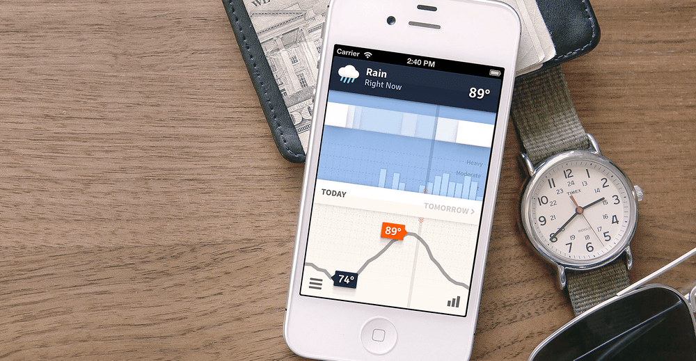
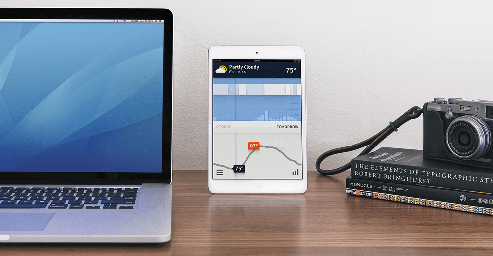
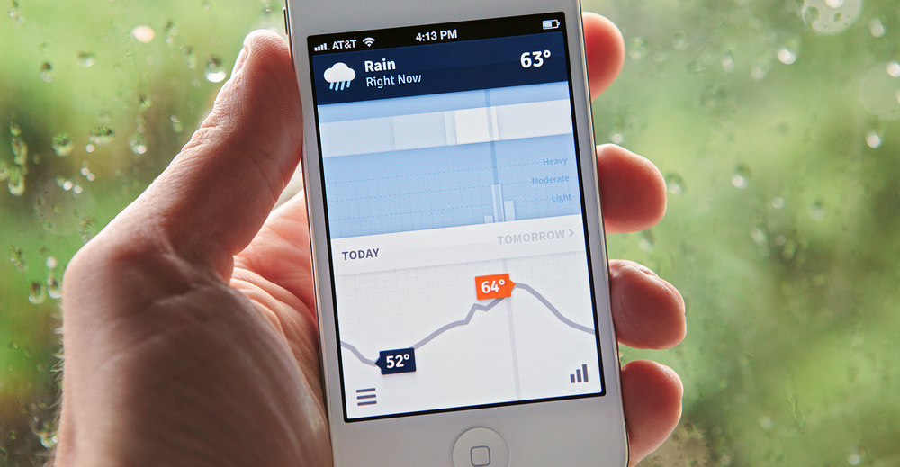
Weathertron is an influential iOS app providing an accurate data visualization of the entire weather day. See exactly what to expect from every hour—clouds, rain, snow, and temps—at a glance.
For most casual users, checking the weather is an occasional task that supports a subsequent decision: planning what to wear, what transportation to take, or when to walk the dog. Making that decision quickly and accurately requires both seeing and understanding a lot of weather variables at a glance.
This use case isn't well served by the simple tabular presentations of most weather apps—especially on small mobile devices. When the user has to scroll around and parse a lot of numbers, it's difficult to understand the entire arc of the day's weather and identify the mix of conditions for a specific time.
Kevin Lynagh and I found some precedent for addressing this problem in Weather Spark, a Flash-based interactive weather dashboard created by Jacob Norda and James Diebel. (Sadly, no longer available in its original form due to the demise of Flash.) Instead of listing weather conditions as a table, Weatherspark visualized the data as a richly layered time-series chart.
Although it was beautifully executed, we found Weather Spark to be a bit of a data firehose—built more for detailed exploration and desktop-based presentation. We wanted to see if we could apply the approach to a format more reflective of our user story: checking the weather occasionally to plan the day, on a small mobile device.
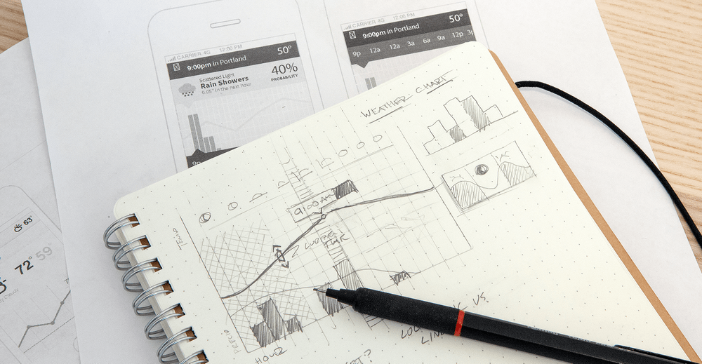
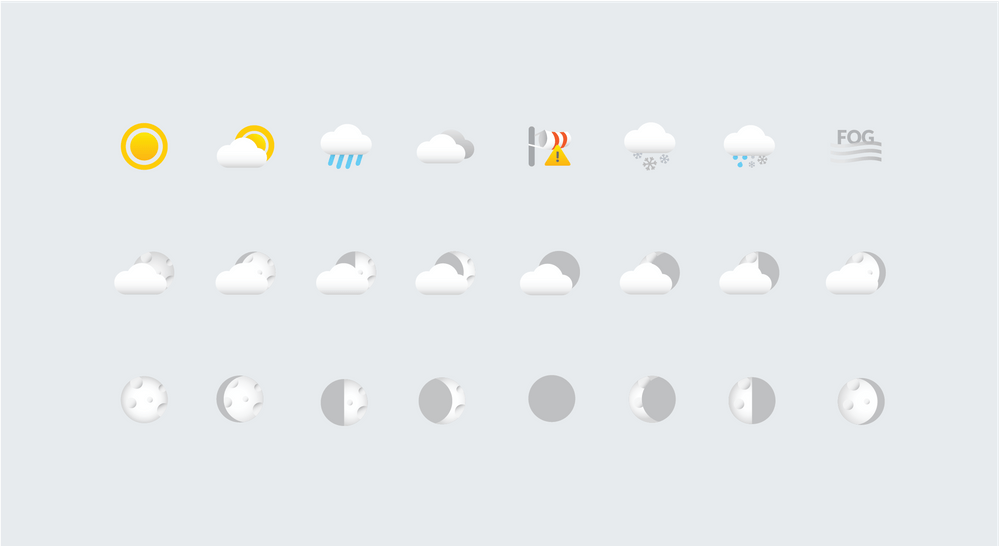
Through user testing on an earlier weather app, we'd found that advanced metrics (like probability of precipitation) were often misunderstood and provided little actionable value to the casual user. So we chose to distill forecast data into a simple set of elements: precipitation amount, precipitation type, cloud cover, and high/low temperatures.
These conditions are then charted as an entire day—from midnight to midnight—across a single screen, with no scrolling required to see the full day. The current time is highlighted and serves as the divider between historical observations and future forecasts.
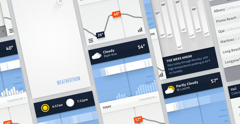
Visual mappings were designed to be instantly recognizable and understandable. Clouds sit at the top of the chart against a blue background and change their opacity based on coverage values. Precipitation amounts scale logarithmically instead of linearly, so everything from a drizzle to a downpour is always visible in a small vertical area.
The ultimate result is a forecast interface that excels at showing relationships over time. A quick drop in temperature accompanied by increasing cloud cover and a big precipitation spike, for example, indicates a storm is on the way.
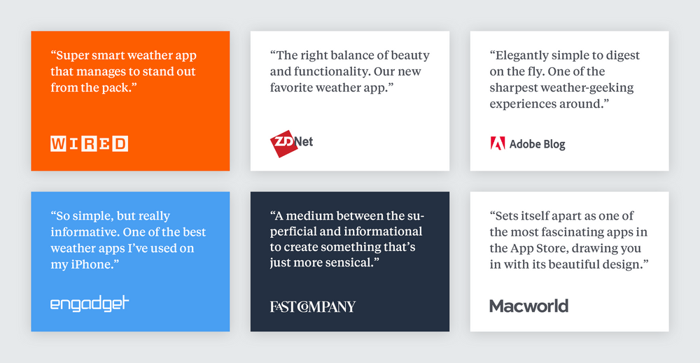
Upon release, Weathertron was ranked as the #1 weather app in the App Store and featured by Apple, The New York Times, Fast Company, and others. The time series visualization approach ended up becoming quite influential and is now a common design pattern across many weather forecast apps.
Weathertron has been lucky to maintain a regular user base and is still available to download on the App Store. While we're no longer actively developing it (outside of occasional maintenance updates), it's still my daily driver weather app of choice.
Next Project →
Designing the behavior of products