Simplifying custom data visualizations
Variance empowered designers, journalists, and scientists to build elegant data graphics for the web—without writing any JavaScript. Its intuitive, HTML-based grammar of graphics supported the rapid creation of clear, practical visualizations, infinitely customizable using only CSS.
Variance was co-designed and developed with Kevin Lynagh to support our own work building data-driven interfaces for clients in health, weather, and energy verticals. The library was subsequently made available to the public in both commercial and non-commercial editions.
Variance took a made-to-measure approach to data visualization. It offered more flexibility and customization than the standard off-the-rack JavaScript charting libraries, but avoided the steep learning curve and development time of a fully bespoke solution like D3.
The ideas behind Variance were influenced by Leland Wilkinson's Grammar of Graphics and Hadley Wickham's ggplot2 library for R.
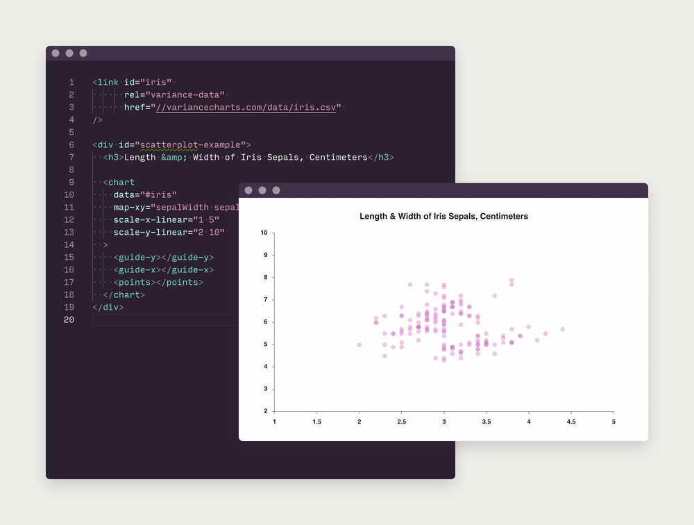
Just as a language's grammar allows for the combination of words into sentences, elements in Variance could be freely mixed together under a basic set of rules. Instead of picking a fixed chart type, the user could combine geometry, guide, and annotation elements to explore a dataset across many different representations.
These structural, semantic elements of a chart were defined within HTML via custom tags like <line>, <point>, <repeat>, and <annotation>. Layout and styling of the graphic could then be controlled entirely using standard CSS.
The result was a lightweight, easy to learn syntax that still supported complex presentational capabilities, like animated charts or mobile breakpoints.
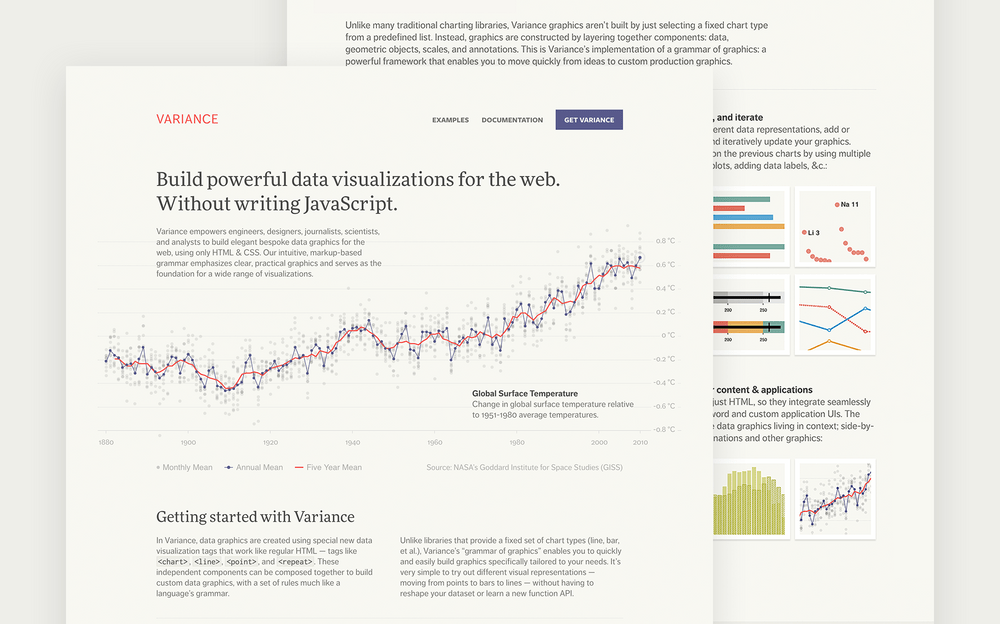
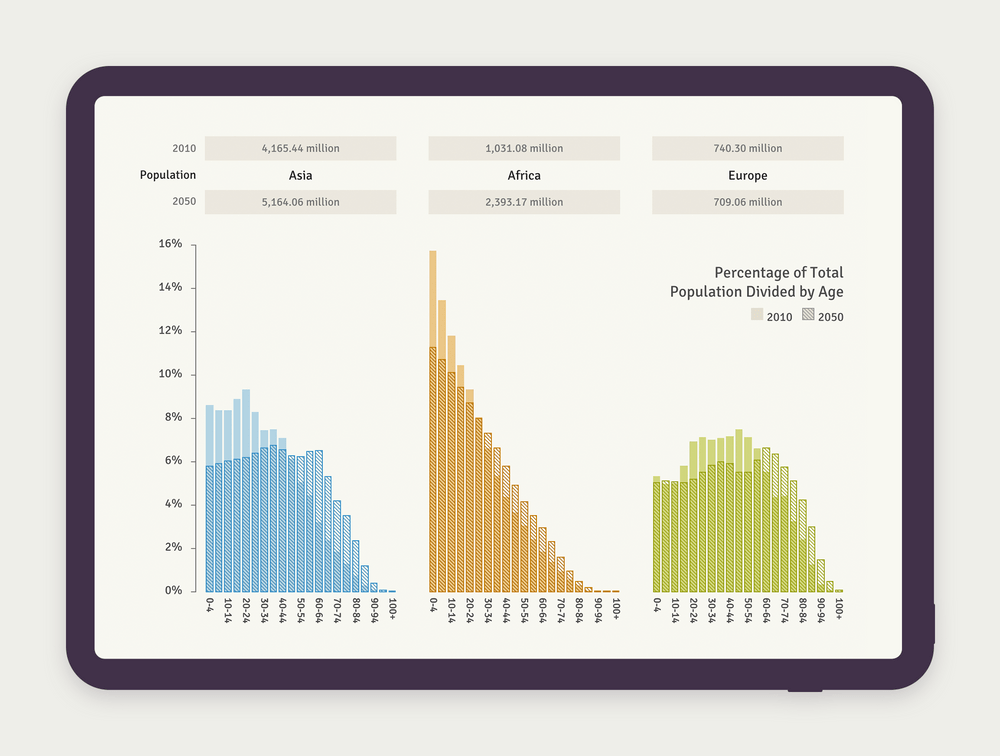
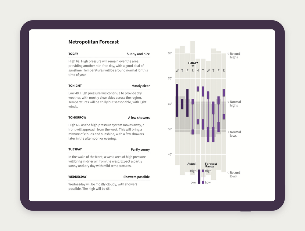
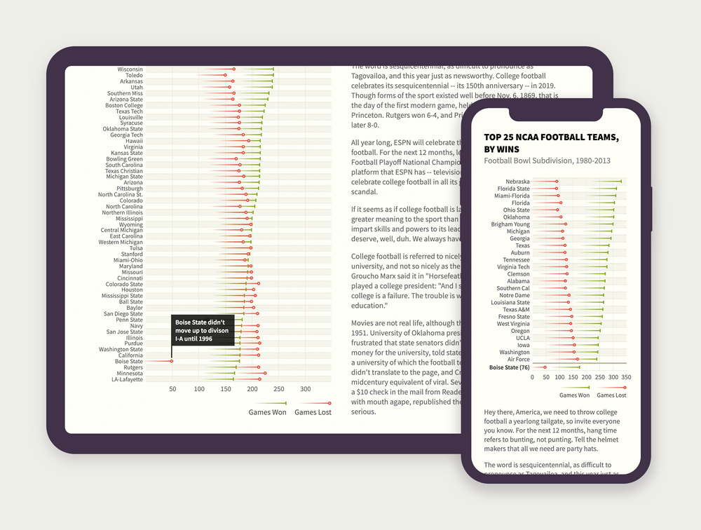
Variance made exploring and creating novel data visualizations accessible to teams without the resources for a dedicated graphics department like the New York Times or National Geographic.
Some other smart folks have experimented with different approaches to this problem domain. Be sure to check out Bret Victor's Drawing Dynamic Visualizations talk, Nicholas Felton's Eyeo 2017 talk, and Jeffrey Heer's Lyra project.
Next Project →
Improving the efficiency of wind farm operations